SEAN CYPHER

A cypher differs from a monogram in that it uses the letters of (usually) of the first name, rather than the three initials of the individual.
When I learned that the image was to be used as a logo for a facebook page, I suggested that we create a cypler rather than a traditional monogram, as facebook is all about friends and family and a "first-name-basis" seemed the right way to go. It also worked better in the shape I suggested: The fleur de lis which represented the "home sweet home" of the man in question: New Orleans.
The sketch above shows the letters overlapped in a manner that I usually like. Intervoven in and out, rather than just placed side by side. I abandoned that plan as the name seemed too obscured.
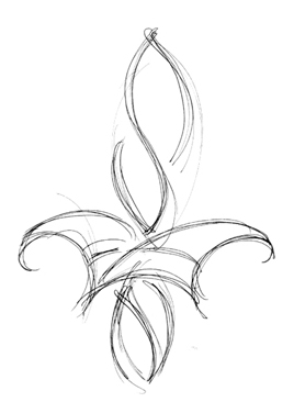
This next version worked a bit better, but I didn't like that the N seemed excluded from the interplay of the other three letters.

This one looked most like a fleur de lis, and perhaps the easiest to read, but the client preferred the one below.

Here the E and A are intersecting a bit, and help to make you see the object as a complex shape first, then later discovering that it is a name.

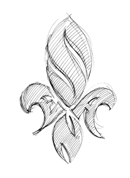
Finally ending up with the one at right. The E and the A pulling towards eachother and making it feel as one complex shape rather than four disjointed ones.

On to color. Initially the clent mentioned to me that he wanted the monogram to be blue and black. But when I thought of how people are continually updating their facebook page I suggested that he could have numerous versions available at his fingertips. This color scheme for this mood, another for that season of year....or whatever his whim du jour.
The one above was the one he uploaded to commemorate his hometown's Superbowl victory.

I even created this psychedellic montage that he plans to use on his web blog.
 |
||
Click on the links listed below to see the following:CALLIGRAPHY....INVITATIONS....MONOGRAMS....MAPS....SIGN-IN BOARDSFAQs....LINKS....ARTIST'S BIO....FAN MAIL....PRICINGOTHER SERVICES "RENDERED"CONTACT PIERBACK TO THE BEGINNING |
||