|
|
|
|
Here's a story of a recent monogram showing the evolution from start to finish.
Even a "simple-looking" monogram has hidden complexities.
|
|
|
|
|
 |
|
|
|
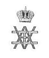
Once upon a time, a client asked me to design a business logo (for an art-consultant business) based on the monogram of the last Tsar and Tsarina of Russia, Nicholas and Alexandra.
You see the imperial monogram above. Reflected double AA atop eachother and intervoven with a cyrillic N (which looks like an H to our eyes).
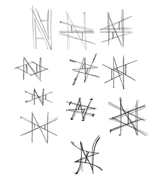
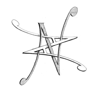
Using a double A and a latin N this time I came up with the following compositions.
|
|
|
 |
|
|
|
 |
|
|
As often happens, I rush forward with my favorite design and come up with a more completed refined version seen above.
(Of course this un-contracted work is not "on the clock".)
I sent these sketches to the client and he felt the one I preferred was lovely but too lyrical.
He chose the composition below:
|
|
|
|
|
 |
|
|
|
He also mentioned that he wanted it to be finished in two solid colors, no crosshatching or other detailing needed.
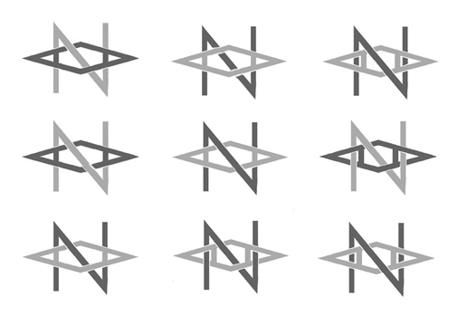
Having refined it further I came up with the following variants on a theme:
|
|
 |
|
|
|
Most of the above show the numerous ways the few lines of the monogram can be intertwined
|
|
|
|
|
 |
|
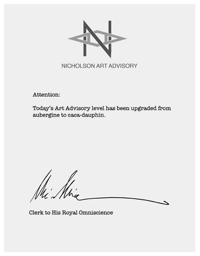
I composed a "letter" and placed the one he perferred at the top to show him how it might look in situ.
FYI: "caca-dauphin" is a true color name quite in fashion with the elite of the 18th century. It roughly translates as "royal baby-shit brown." It seems to me that that hue would be a downgrade from aubergine, but color is not my strong suit.
|
|
 |
|
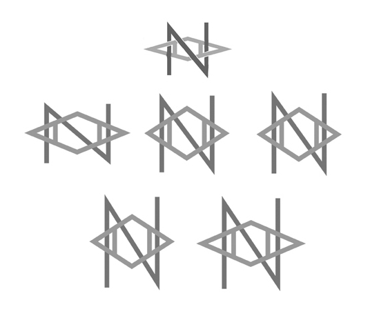
The client was 90 percent happy, but wanted the trapezoid of the AA to be wider.
I sent off the options shown above, some of which involved widening the N as well as not to cause tight areas from being too overly congested.
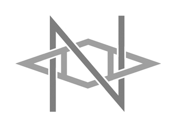
The client made his choice and I interwove the monogram and the resulting final version is shown below.
|
|
|
|
 |
|
|
|
Were this in color you would see the N printed in a beautiful shade of aubergine hoarmonzing perfectly with the double A printed in puce accented with a slight hint of caca-dauphin.
Speaking of color look at the one below.
|
|
|
 |
|
|
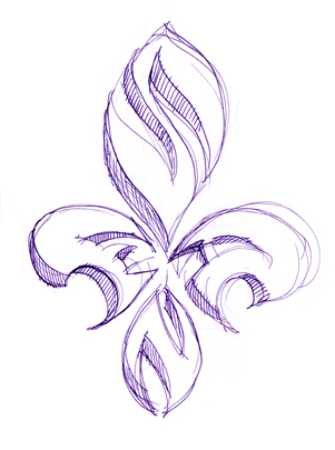
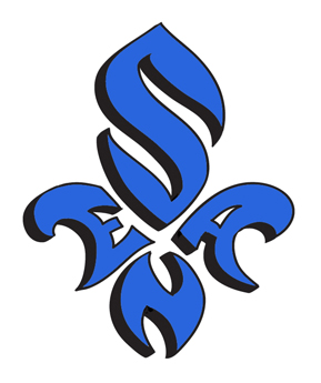
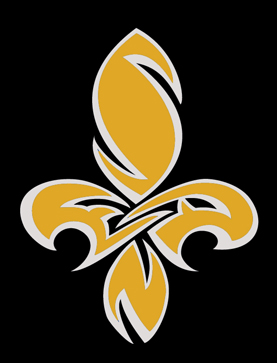
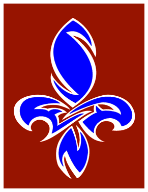
Here we have a monogram, or rather, cypher of the name Sean.
I came up with the idea of using the four letters of his first name in a fleur de lis pattern which is decorative but more importantly anchors him firmly to his "home sweet home" in New Orleans.
|
|
|
|
 |
|
|
|
|
We tried a few variations. Letters too obvious on the one above...not enough mystery.
|
|
 |
 |
|
|
|
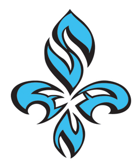
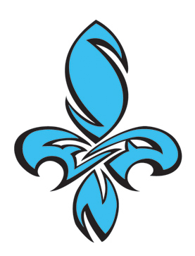
Finally ending up with the one at right. The E and the A pulling towards eachother and making it feel as one complex shape rather than four disjointed ones.
|
|
|
|
|
 |
|
|
Initially the clent mentioned to me that he wanted the monogram to be blue and black. But when I discoved that one of the planned uses was to be an icon for his facebook page I suggested that he could have numerous versions available at his fingertips.
The one above was the one he uploaded to commemorate his hometown's Superbowl victory. Other color combinations were to be used for Christmas and Valentine's Day.
|
|
|
|
 |
|
|
|
|
I even created this psychedellic montage that he plans to use on his web blog.
|
|
Click on the links below to navigate this site.
|
|
|
|
|
|
|
|
|
|
|
|
|
|
|
|
|
|
|
|
|
|
|
|
|
|
|
|
|
|
|