Banner Motif
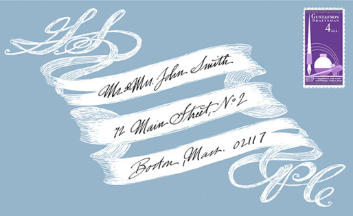
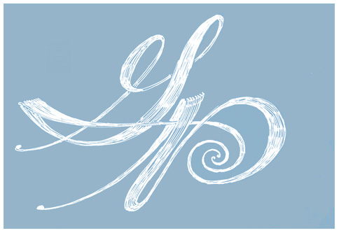
Within we find the initials of their first names on the cover of the invitation.

You've noticed, I am sure, that no calligraphy is seen on this ensemble.
We decided to have all the elements typeset (click on the program for a detail). Calligraphy is like a spice to be used sparingly. To have everything calligraphed would be overkill, not to mention extremely difficult to read in the dim light of a cathedral or flickering candlelight of the cozy restaurant.
Only the envelopes and escort cards were hand-calligraphed.
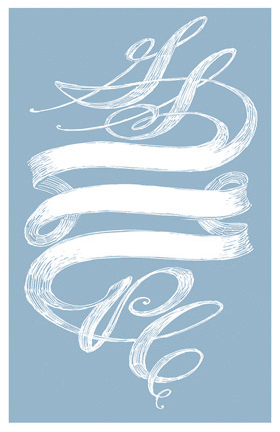
The same design was altered to be quite shorter for the simple three course dinner twhich followed .
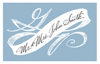
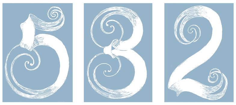
The escort card above directed the guests to the tables designated by the banner-numbers below.
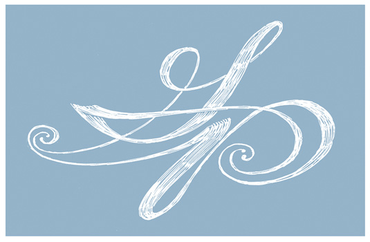
Thank-you notes were written on cards having the image above on its cover. You might think it is the same as the cover of the invitation. Look again.
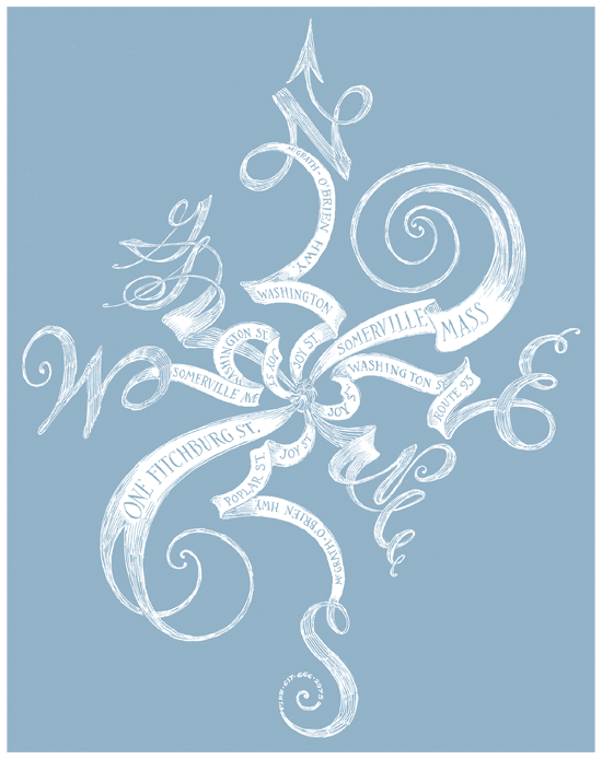
I also designed a map to their new home using the same aesthetics.
